
Saturday, 19 May 2012
Female priest coloured.
Painting progress.

I've improved the wings a lot, making them look more realistic. I think the dragon looks good now, I'm just a little unsure about the character. I'm hoping to improve her a bit more when I paint the piece.
Villain inspirations.
I often get my inspirations from random places... however, a lot of inspiration tends to come from the world of anime & manga. Although not the most realistic style in many cases, I am hugely inspired by many artists who work in the style, and will often get an outfit idea or such from anime I've watched or manga I've read.
 ^ (Idea for the lower dress)
 ^ (Idea for the pigtails!)
I get many influences from the gothic lolita style of fashion that is popular in Japan (and becoming more popular every year in the UK).


I get many influences from the gothic lolita style of fashion that is popular in Japan (and becoming more popular every year in the UK).

Although many artists may be put off the style of anime & manga due to the rather unrealistic proportions, I believe that a sense of realism can come from the style through the use of textures and shading, as well as toning down the more crazy elements that exist throughout, such as the large eyes (amongst other things!). Getting rid of the black outlines such as in the piece below also helps create a sense of realism, especially concerning the hair.
Warrior coloured.

I'm not sure how to make her armor and sword look more metallic, so I've asked for some feedback on that. Otherwise I'm pretty happy on how the shading has turned out on her clothes and hair! I do think the sword looks a little off so if I was to improve, I'd change that a little.
Friday, 18 May 2012
Dragon painting...
I needed some tips for the dragon I'm painting so, I decided to research it.
Scales


References:

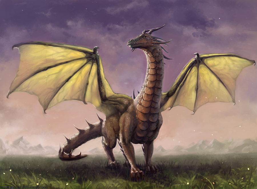
Working on painting piece.

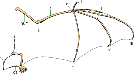
"The back legs are actually okay, just bring the one on the right out to the right some. The wings though, think of wings like human arms: there is a shoulder joint, an elbow joint and a wrist joint, and they don't come out as one line."
" I would suggest that you add more perceptive to it and work on realism (but I'm assuming you're going to work on that on Photoshop, eh?)
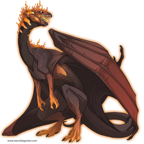
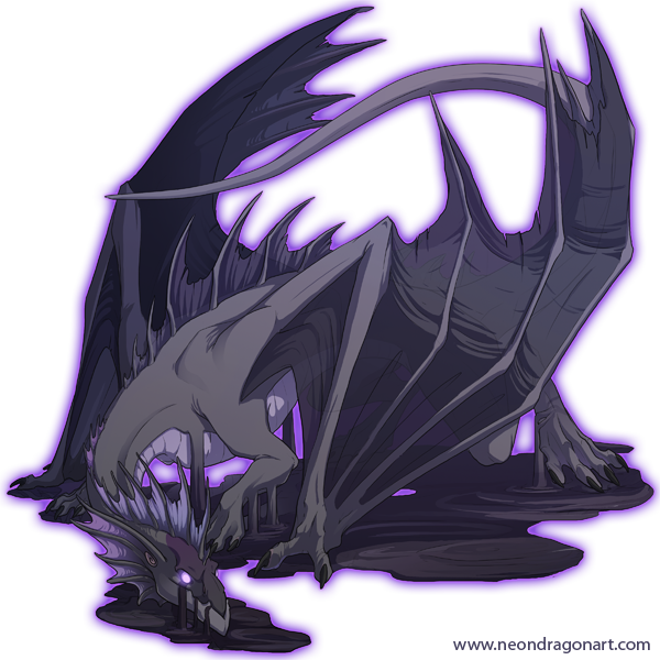
You could always look up Neondragon's artwork. She's amazing--and she has a few tuts on her website on drawing fantasy creatures and etc."
(I told her that the piece is on canvas and I'm not using Photoshop, and am waiting for more feedback.)
I have a book on dragons which actually has a realistic bone/muscle structure in so I'm going to use that as a reference to work on the wings. I've also looked at the anatomy of bird wings and other animals:


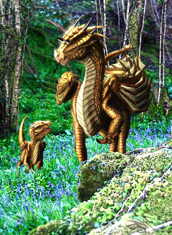
I've taken a look at Neondragon's work on her DeviantART:

Sunday, 13 May 2012
Research and Ideas for villain painting.
I decided a few days ago that I wanted to do a piece of the main villain from my game for my painting final piece.


I've been researching and thinking about it loads, thinking of what ideas I can use:
- Female enchantress/witch
- Dragons
- Wings/Horns
- Succubus/Incubus
- Existing game villains/creatures. EG: Ifrit & Garuda from Final Fantasy XIV

Above: Ifrit!
Below: Garuda concept art
Below: Garuda concept art

Research for inspiration:


Looking at art by Mike Nash for inspiration:


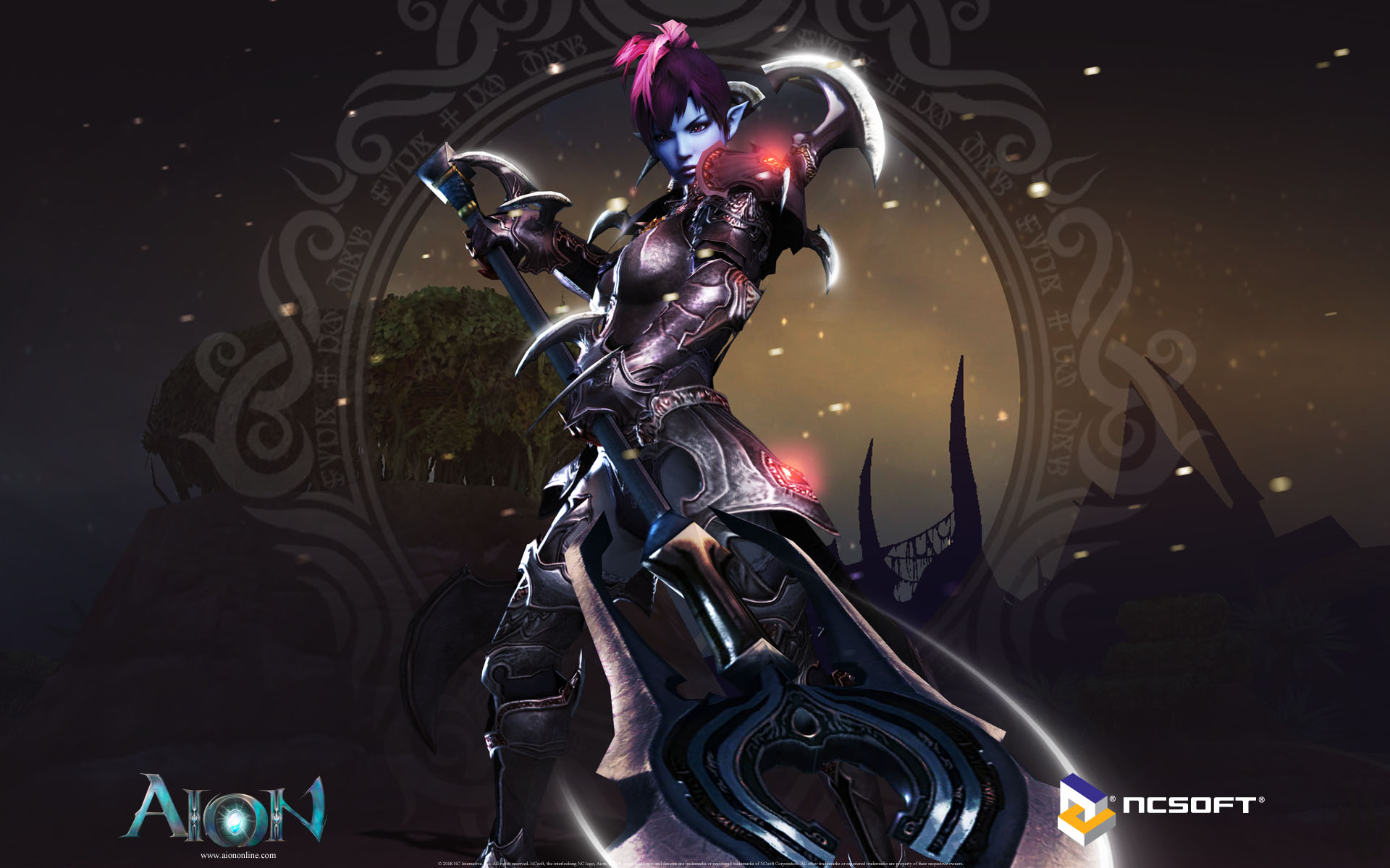
From an online game called Aion, where the player can create either a good or evil character (looking at the evil race here):


I like the idea of including a dragon in my piece as the villain's companion; perhaps as a big part of the background...

...or perhaps with a smaller creature.

What I've noticed about pretty much all the artwork I've seen so far is that the female villain character is always typical - they're always drawn quite appealing and sexy. I want to do something a bit different for my character - I want her to be dark and evil, but in a surprising way. I could do this by making her something unexpected.


I could do this by making her look quite 'cute' or like she doesn't really have much power. I do want to reflect her dark personality though, so this will be a challenge.
I came across a piece that I really like:

I researched the artist from the signature on the piece ('Chain & Jane') and found out that it's by a pair of Chinese artists who do fantasy artwork. They appear to work mostly in Photoshop and Painter. I really love their style of art but I don't think I could do it myself, as it looks really realistic and I'm still trying to grasp that style in my work.
I came across two painters on Google - Jasmine Becket Griffith and Natalia Pierandrei.
Jasmine Becket Griffith has a very gothic style; she mostly does fantasy elements in her work, including fairies and witches. She uses acrylics. One of the most striking things about the characters she creates are their eyes; she is obviously influenced by the 'chibi' manga style through the proportions and colours in her pieces.


I like her work; I love the bright colours that stand out from the dark. I think I might use a similiar colour pallet in my work. However, I don't think I want to use her style in my work, with the big eyes and roundish heads - I'd prefer to do something a bit more realistic.
Natalia Pierandrei's work is probably one of my most favourite art style I've seen so far - she uses watercolours but most of her work has pale colours with some standing out more than others. I also really love the style in which she does her characters in.


Looking closer at her work, I can see how she shades; she does block colours in black outlines, simple yet effective. I think I will use her style as an influence for my work, but with brighter colours to match the theme of all my other pieces.
For my conclusion... I have come up with the main factors I have to consider about my piece:
- Colours
- Layout & Composition
- Background/scenery
- Techniques and materials
For colours, I want to go with my main theme and use bright, bold colours that stand out. However, because this is a dark piece, I will use darker colours than the usual; I will still have reds and purples, golds, ect. standing out though.
I will experiment with the layout and see what looks good; I think I will have the dragon quite large, with the villain in front. I like the idea of using the size of both the main points in the piece stand out - the dragon being massive compared to the villain. I think I will have her sitting on his foot or tail to show this.
I want quite a dark background - or perhaps something reflecting the darkness that surrounds the villain. I like the idea of having a blue sky, green forest and such in the very background, with dark clouds surrounding the villain; I have to think about where the skyline is going to be within my piece, and the size of things compared to the dragon. I have to consider how much background is going to be shown at all, as the dragon will take up a large amount of space if I want the villain to be clearly seen in the piece. The canvas is quite large though so I'm not sure if this will be a problem or not.
For painting techniques which I have researched, there are many I could use; I could use wet on wet to create the sky in the background with a nice fading effect, and lifting techniques to create the effect of clouds. If I wanted to add an element of texture to my piece (ie; on the dragon?) I could use the impasto technique with oil paints. I think I will probably use gouache paint as this is a good paint for the style that I work in (bold, bright and flat colour). I think I will add a black outline in my piece, similar to Natalia Pierandrei's work; however, I will use colours inspired by Jasmine Becket Griffith's pieces. I also have some influences from the painter Camilla D'Errico who I have mentioned earlier in my blog.
Images - Google Image Search
Artists - Jasmine Becket Griffith, Natalia Pierandrei, Jiansong Chen and Jie Jiu (Chain & Jane), Mike Nash, Camilla D'Errico
Saturday, 12 May 2012
Hiromu Arakawa

Throughout her childhood, she thought about becoming a manga artist; after she graduated from school, she spent seven years doing oil painting classes whilst working on her family's diary farm. Throughout her manga series, she draws her self-portrait as a bespectacled cow to represent where she used to work! Photos of her are incredibly rare due to her keeping her personal life very private.
Her inspirations include Suiho Tagawa, Hiroyuki Etō, Rumiko Takahashi and Shigeru Mizuki; she is also a fan of Mike Mignola's work.
I find her a huge inspiration to my work; I love the characters she creates and her style she uses. I like how she uses watercolours in her work - it gives it a real depth to it through textures and shading, and combined with her own unique manga style, makes it stand out from the typical styles used throughout Japanese art. A lot of my art is influenced by her and I have learnt a lot from studying her work for the past few years.

XBOX front cover piece.

I've already got a template from the internet for the cover, and am going to use that. The colours used in this piece are specially designed to coincide with green tones used in Xbox covers - ie; the green of his hair and her skirt.
I need to think about where I am going to position this piece amongst the text, logo and whatever else I may have on the finished cover. I also need to think about the back of the cover and what is going to be there.
Fairy piece coloured.

If I was to change anything, I'd probably edit the colours slightly so she reflects the nature aspect about her; the hair was originally green but I changed it, due to already having another character with that colour hair.
Catgirl piece coloured.

Original Drawings.


I've done every character in a certain pose to try and reflect their personality. I referenced all the poses from a book called 'The Monster Book of Manga: Girls'; I changed some aspects myself, like the clothing, hair and faces.
Insight into the book I used: http://www.harpercollins.com/browseinside/index.aspx?isbn13=9780061537943
Subscribe to:
Posts (Atom)